Showing posts with label Art. Show all posts

Thursday, February 6, 2014

Sticks, Stones

A few years ago, my brother and I decided that we wanted to try building our own arcade sticks to play Street Fighter online with each other. I went so far as to get a stick and buttons, and shipped these things to him so he could cannibalize some old PlayStation controllers for use. Then, well, stuff just got in the way; he moved his family to South Carolina, I wound up buying a couple of sticks on my own, he went pro-Nintendo with a Wii and Wii U and, well, I didn't.

My brother, though, is a serial hobbyist; the kind of guy that gets into something full steam and then slowly forgets about it for his next big adventure. I envy people like this sometimes, actually. I get the impression that they constantly feel like the world has something to offer them while guys like me are waiting for their own hobbies to wow them again like they used to. Anyway, the joystick thing was something he never really had an opportunity to get into like he normally would, so he recently decided to modify a Madcatz SE stick that I gave him for Christmas a few years ago, and asked for some art.

Now, I'm not a spectacular artist by any stretch (we've known this for a long time), but this was something small enough in scale that I didn't mind lending a hand. It also gave me the opportunity to try out some digital coloring, which is something I've always wanted to mess with.

The process was pretty painless. I downloaded a template for the SE stick pretty easily found all over the internet. He told me that he had some colors in mind because he was planning on painting the stick casing. The buttons and joystick that I sent him all those years ago were red, and he wanted to make them match the illustration, too.

From there, and after some doodling to get my hand back into sketching shape, I printed a small stack of them and drew the image right on the template. This turned out to be really hard, actually. Since you're dealing with whole chunks of the right side of the image being obscured by the stick and buttons, managing the composition was a lot more challenging than I thought. Once I get used to that, though, I settled on one that I thought was fine:

Knowing that I was going to color it digitally, I left the background blank planning on adding text and color later. I inked it traditionally with pens and a brush, and scanned it.

That's when I went a little crazy. I couldn't stop making these. I had three more sketched out, and two more inked, so I scanned one of those, too:
I wasn't totally thrilled with having a joystick where his nose would normally be (but now that I think about it, I can totally do a holiday image and make that red ball-top stick Santa's button nose. The possibilities!), but the prospect of coloring without traditional media meant that larger objects like the bicep and the forearm might be easier to practice with than what I had planned for the "kick" image above. Same thing with the inking- paintbrush and some pens.

I met some cool folks a few weeks ago whom gave me some advice into the digital process. Upon their recommendation, I scanned it them at 600 dpi as a tiff image, which I eventually exported to a bitmap. This set me up for the next big challenge: the actual coloring.

I used Gimp and scoured the internet for tutorials on how to color using a mouse. Since I don't have the setup that most people that do this seriously have, I needed to find a decent tool to use that I could navigate without dropping some money into actual hardware. Gimp is a really great free product, though. With my limited understanding of Photoshop (which has all faded away in the 10 years since I've actually used it) I didn't need anything with extensive bells and whistles, and the tutorials I found on the internet made it pretty clear that Gimp is an amazing facsimile for the price of admission (which, again, is the low, low cost of absolutely nothing).

Here's how things went:


I wound up coloring this one first because I thought it would be easier for some reason. I went a little overboard with the layers of gray in the gi (I think there are four altogether), so I scaled it back for the skin, gloves, and headband. I'm actually happy with the way it turned out, and it was a nice confidence boost for the second one, too. Here's how that one turned out:
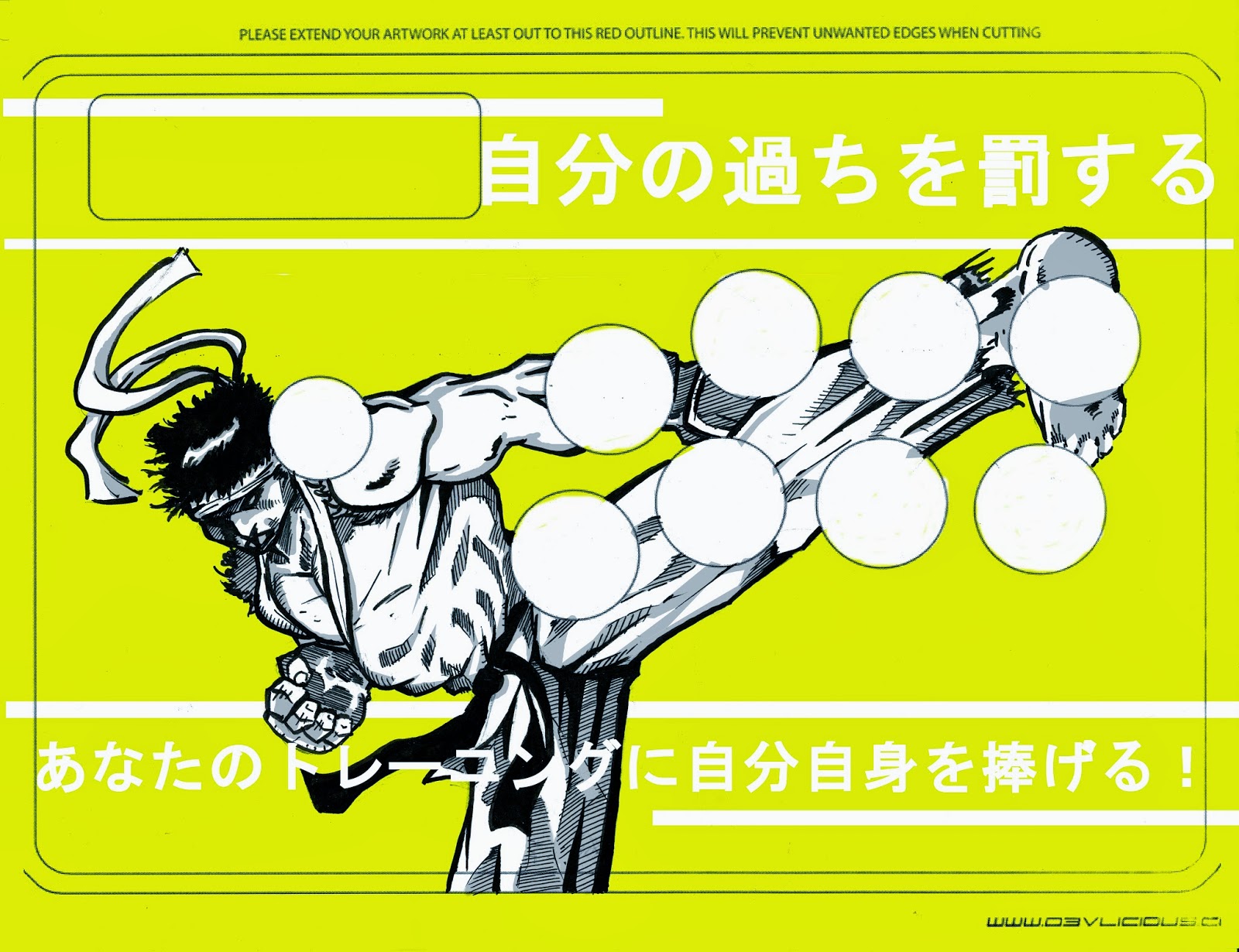
This one I'm on the fence about. The colors that I was given were gray, black, white (natch), red, and yellow. That's two warm colors with one cool one, which I didn't find that easy to translate without ditching one or the other. We can chalk that up to my lousy use of color theory, I guess. For this one, I wanted originally to make it look like an old poster with some text, but that didn't wind up working so well. The text is in Japanese and came from Google Translate, so if any of you speak it fluently and catch mistakes you can go ahead and give the internet the old stink eye, not me. The bottom reads "Devote yourself to your training," which is something I lifted off of some old Street Fighter III promo art. The top reads "punish their mistakes," which is a reference to the use of this mule kick move in the SFIII games, which is primarily to make people pay for whiffing big moves.

I have a couple more unscanned images that I might mess with just for fun, but they need some work first. Still, not bad for a first attempt.

Friday, November 8, 2013

Step 2: Inks Complete

So here it is with finished inks:

The picture robs you of some of the minute details, but I think you get the idea.

As usual, all of the tighter stuff pencil-wise wound up looking pretty good like the upper arm and the face. I pretty much wing it when it comes to cloth with a lot of black (as in the cape of this wizard/ ghost/ thing), but I think it looks fine here. I might go in with a whiteout pen and place in some cracks or little details in there, but I'm trying to let go and just let it live on its own. The ink I was using is pretty old, though so you can spot a lot of inconsistencies with the value of the blacks, but whatever.

I guess the only thing that really bugs me is that the swirling vortex of evil- sort of background wound up being a little bit busy and takes away from the foreground a little bit, but that's all because I decided to live on the edge and do that on the fly, too. Originally, it was just going to be blank back there with some detail lines and some sweat/ blood spurts to make it look like they were really going at it, but I thought that might be sort of chickening out. Not that this is the most elaborate background, but having nothing there at all seemed kind of weak.

Still, for the first pinup kind of thing I've done in a couple of years I think it wound up being ok. Now I have to decide if I'm going to color it, and I'm not so hot at that stuff. I can probably lay down some watercolor or marker and make it look ok, but I just don't have a lot of skill any more and I'm too afraid to blow it this far in.

Thursday, November 7, 2013

Mighty

A few (read: many) years ago, a couple of musicians that I worked with decided that they would record a prog metal EP. Mostly, this was an ironic joke: all of them were trained jazz musicians (and pretty good ones) with the only earnest member of the ad hoc trio being a classic rock tone poem enthusiast as a kid, which found its way to inform his choice of profession. As you may have guessed, he was also the writer. So I how was I involved in this? Since I have pretty much zero talent for music, they thought it funny to have a sort of over -the-top Manowar-style sword and sorcery cover for the five or six discs they were planning on burning, so they asked me to throw something together. Here's what came out:

Yes, there's some strange anatomy going on right there. Since this is pushing 15 years old at this point, and everyone's their own worst critic, I don't think it's unfair to say that this is one of the butt ugliest things I've ever seen. Still, it was my way of learning some of the basics of Photoshop (many of which I've forgotten), and they really dug it, so it wasn't a total loss.

As another kind of gag, I put together two or three redone covers for the writer guy. The music industry of the late 90s/ early 2000s just loved to repackage recently released material with special covers, so I jumped on board and did this:

I liked this one better, but probably because it was just separate scans of other stuff I sketched out that I cobbled together on a computer. The guy in the back was colored with markers and the spiky haired dude in the foreground was all magic wand and paint can. Except he doesn't have any ears. That's a little strange.

Anyway, so I haven't even thought about these since I made them and they've recently kind of resurfaced. Me being a dope that just can't let go, I've been a little inspired in the last week to do a sort of weird follow up. Let's call it the art for their never-to-be-released anniversary boxed set:


I wish I would have taken a pic of this in its primordial sketch form. I'm not really a great inker to begin with, and penciled images just seem to have a different dynamic to me; they're more exciting. This isn't the clearest picture, but I was about half done with the inks before taking it. Since I don't have a ton of time on my hands anymore, I sometimes doodle this stuff out during my lunch breaks, which gives me a solid hour to nail down a composition and decide where things need to be tighter and which parts can be looser. The sketch happened on Monday, and the beginning ink section went down on Tuesday. I finished inking it yesterday, so I'll put up a pick of that sometime later today or tomorrow.