My brother, though, is a serial hobbyist; the kind of guy that gets into something full steam and then slowly forgets about it for his next big adventure. I envy people like this sometimes, actually. I get the impression that they constantly feel like the world has something to offer them while guys like me are waiting for their own hobbies to wow them again like they used to. Anyway, the joystick thing was something he never really had an opportunity to get into like he normally would, so he recently decided to modify a Madcatz SE stick that I gave him for Christmas a few years ago, and asked for some art.
Now, I'm not a spectacular artist by any stretch (we've known this for a long time), but this was something small enough in scale that I didn't mind lending a hand. It also gave me the opportunity to try out some digital coloring, which is something I've always wanted to mess with.
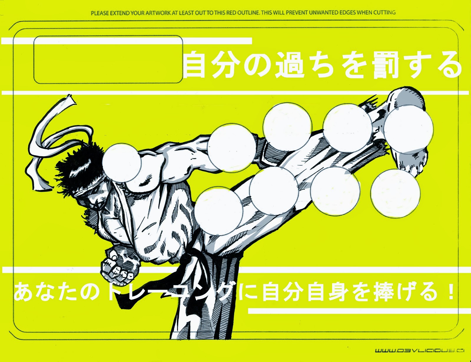
The process was pretty painless. I downloaded a template for the SE stick pretty easily found all over the internet. He told me that he had some colors in mind because he was planning on painting the stick casing. The buttons and joystick that I sent him all those years ago were red, and he wanted to make them match the illustration, too.
From there, and after some doodling to get my hand back into sketching shape, I printed a small stack of them and drew the image right on the template. This turned out to be really hard, actually. Since you're dealing with whole chunks of the right side of the image being obscured by the stick and buttons, managing the composition was a lot more challenging than I thought. Once I get used to that, though, I settled on one that I thought was fine:

That's when I went a little crazy. I couldn't stop making these. I had three more sketched out, and two more inked, so I scanned one of those, too:

I met some cool folks a few weeks ago whom gave me some advice into the digital process. Upon their recommendation, I scanned it them at 600 dpi as a tiff image, which I eventually exported to a bitmap. This set me up for the next big challenge: the actual coloring.
I used Gimp and scoured the internet for tutorials on how to color using a mouse. Since I don't have the setup that most people that do this seriously have, I needed to find a decent tool to use that I could navigate without dropping some money into actual hardware. Gimp is a really great free product, though. With my limited understanding of Photoshop (which has all faded away in the 10 years since I've actually used it) I didn't need anything with extensive bells and whistles, and the tutorials I found on the internet made it pretty clear that Gimp is an amazing facsimile for the price of admission (which, again, is the low, low cost of absolutely nothing).
Here's how things went:

I wound up coloring this one first because I thought it would be easier for some reason. I went a little overboard with the layers of gray in the gi (I think there are four altogether), so I scaled it back for the skin, gloves, and headband. I'm actually happy with the way it turned out, and it was a nice confidence boost for the second one, too. Here's how that one turned out:
I have a couple more unscanned images that I might mess with just for fun, but they need some work first. Still, not bad for a first attempt.
No comments:
Post a Comment